2023 · Design system
Building a design system
When Singlife and Aviva merged, I led the work to bring disparate design libraries into one cohesive system.
The challenge
Unify a fragmented design language
Multiple libraries, styles, and principles had left the product experience inconsistent and difficult to scale.
The outcome
One shared source of truth
The new system gave teams a cohesive language, reusable building blocks, and clearer guidance for every touchpoint.
Project overview
A unified system after the Singlife–Aviva merger
When Singlife and Aviva merged, we inherited numerous disparate design libraries. I led the work to redefine our design language, consolidate and recreate assets, and update existing components into a single, cohesive design system.
I rallied a team of designers to establish this unified source of truth while continuing to manage our ongoing project commitments.
Role and scope
UX/UI Lead, from direction to delivery
I led four UX designers to deliver an MVP in eight weeks, defining the system’s direction and coordinating the work needed to bring it into everyday product practice.
Why it mattered
Inconsistency was slowing everyone down
Inconsistent CX. Multiple libraries resulted in different design languages, styles, and principles across applications, making web and mobile experiences feel fragmented.
Confusing design directions. Inconsistent wireframe guidance and arbitrary naming conventions made it hard for designers to find and confidently use the right elements.
Developer challenges. Diverse technologies and numerous component libraries led to repeated questions about nearly identical components and how to share UI across frameworks.
Our strategy
Build a shared language that could scale
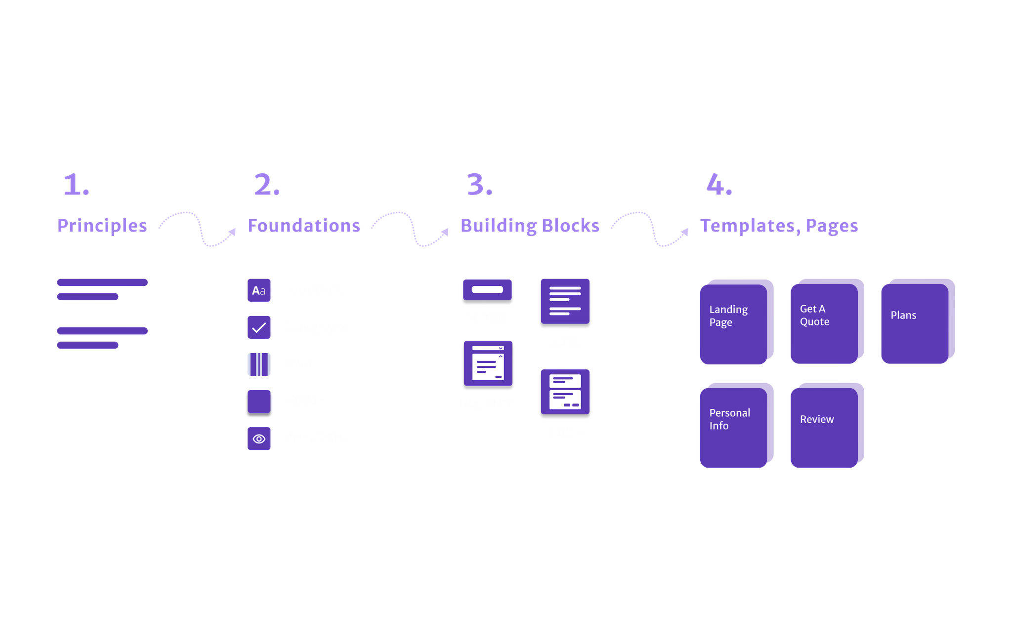
We grounded the system in design principles and created the foundational elements needed to consistently produce high-quality interfaces through streamlined design and code processes.
- Design principles as a guide and compass
- Foundation elements including colour and typography
- Components as reusable building blocks
- Usage guidance and a documentation website
- Fireplace, a dedicated space for feedback and collaboration
01
Design principles
02
Foundation elements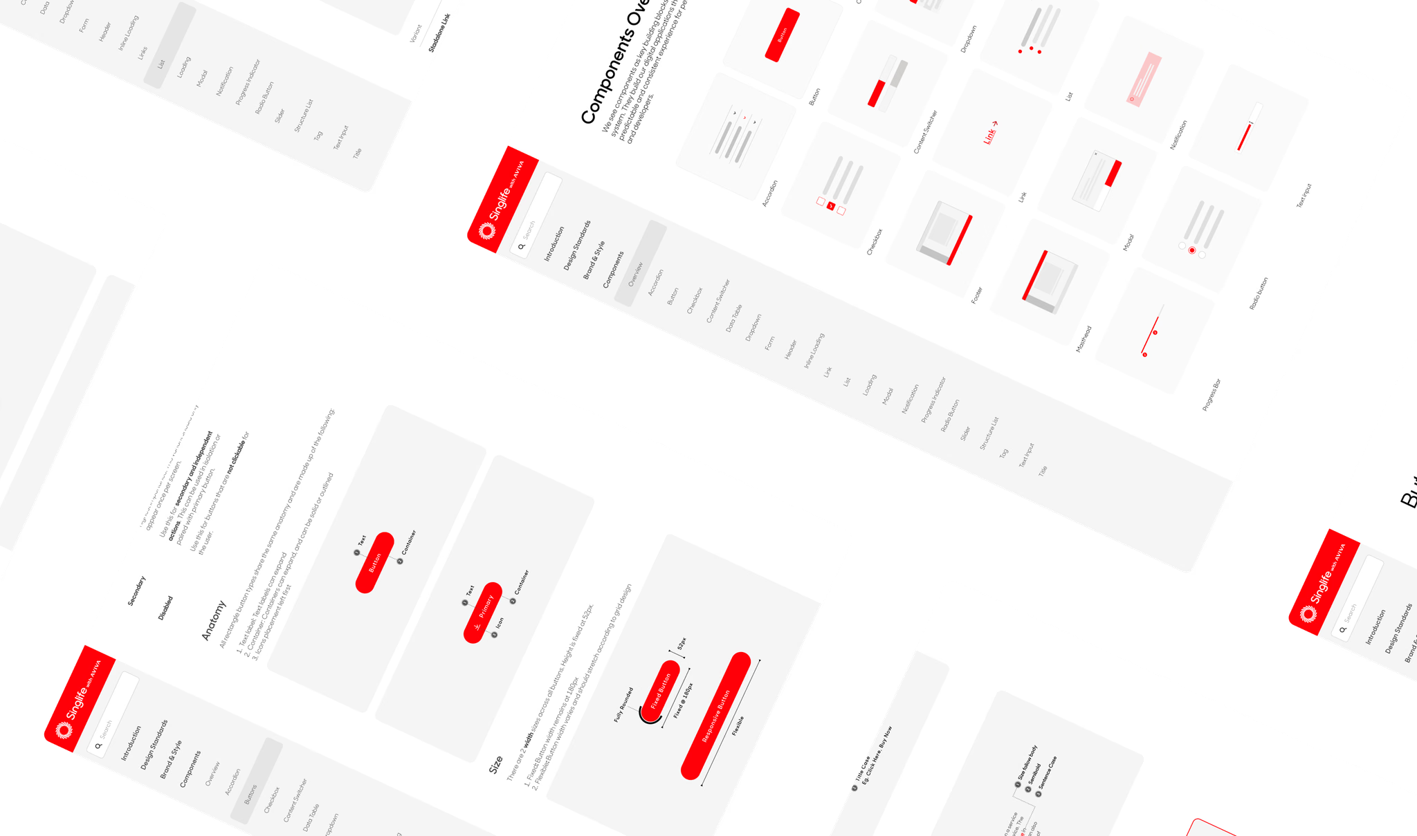
03
Reusable componentsThe system
From principles to practical building blocks
Design principles drew from customer needs, brand values, and the team’s own values—giving the system personality and a shared way to shape new components.
Foundation elements covered tone of voice, colour, typography, iconography, illustrations, grids, and spacing. Colour, typography, and spacing were designed to meet WCAG AAA standards and APCA contrast ratings of at least 60.
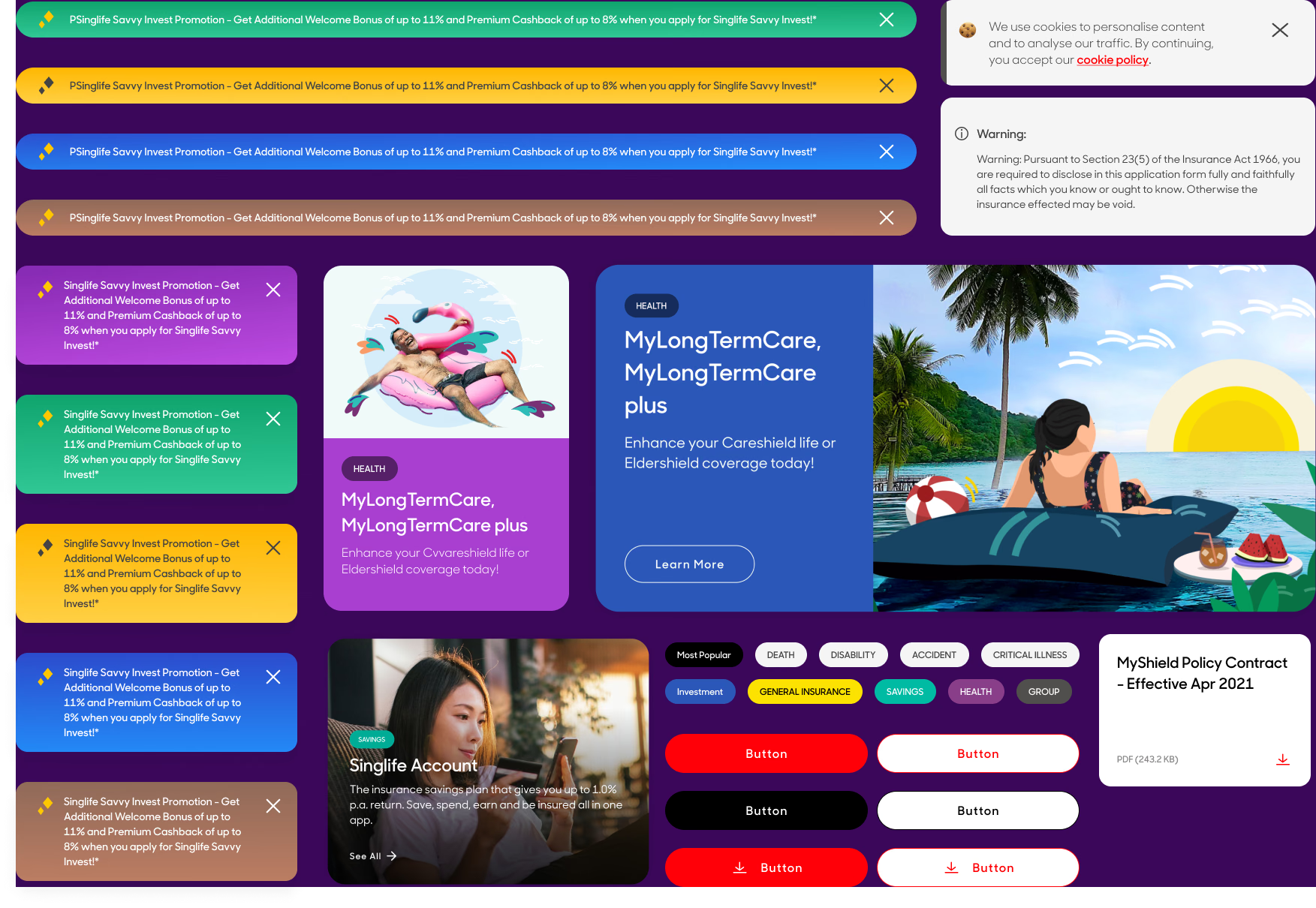
Components and templates made interfaces more consistent while allowing flexibility for specific cases. Text styles, spacing, padding, and corners remained consistent, while templates and component groupings helped teams move faster with fewer errors.
Guides and resources documented each component’s structure, style, and usage, with a dedicated website and links to React and Angular Storybooks for development.
Collaboration
Fireplace made the system a shared practice
I started Fireplace, a bi-weekly gathering for designers to discuss the system’s direction, new components, library updates, and real-world cases. It became a space for learning, feedback, and a stronger design community.
Outcomes
Adoption, speed, and a more cohesive experience
- 100% adoption across all design teams
- At least 30% less time needed to ramp up design mock-ups and prototypes
- Consolidated 10 design libraries into three: Foundations, Components, and Illustrations
- A comprehensive design-system website with usage guides
- Consistent UX and UI across Singlife’s digital products
- A consolidated React Storybook for developers